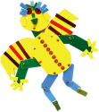
The design of our logo was inspired by the idea of the four seasons in nature. Just like the ever-changing nature of seasons, our logo represents the progressive nature of children’s learning. Similar to the progression of life, there will be laughter and tears, setbacks and progress in their learning. Children should be able to enjoy every season in their childhood, as well as experience emotions such as happiness, anger, sorrow and excitement. Therefore, we chose the ancient Chinese character 季 for Seasons to be the blueprint of our logo design. The green and red areas at the top of the design represent the harvest and changes of the seasons; the black area at the bottom represents a child playing with a bow; and the blue area in the middle represents the ocean deep potential of every child, who is waiting for the teacher to guide him/her to shine like the sun.

